Aerotime
Jan 2023—July 2023
About
Aerotime is a modern calendar that helps people prioritize their work by goal setting, time blocking, and reducing fragmentation created by randomly placed meetings and distracting Slack messages.
Work
We had the chance to collaborate with Aerotime in January of 2023, initially to help increase conversion and stickiness of users—both problems at that moment.
Our engagement quickly expanded to handling product, from development of new product features to turning insights derived from user interviews into tangible changes in functionality and design.
Focus holds in Aerotime.
Onboarding
One of the first challenges we were presented with was the difficulty in getting users onboarded. We quickly noticed that retention numbers for users who downloaded the macOS application was 5-10x higher than the browser users. Talking to users revealed that this was primarily due to the tight integration with macOS.
It’s really tough to make a good onboarding. We had to temper our enthusiasm to talk about all the things that Aerotime did differently, opting only to show off two fundamentals that we noticed users found the most useful:
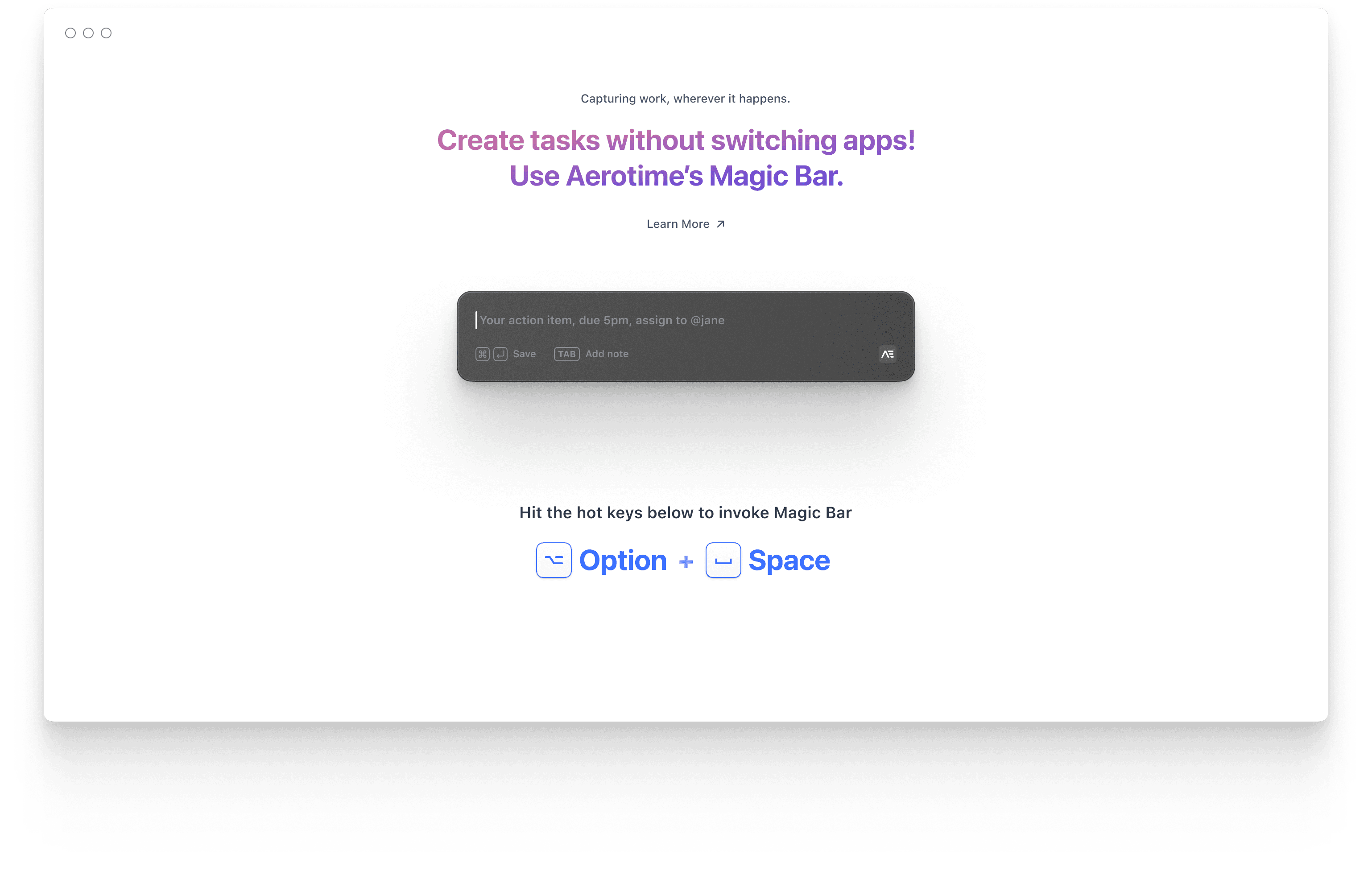
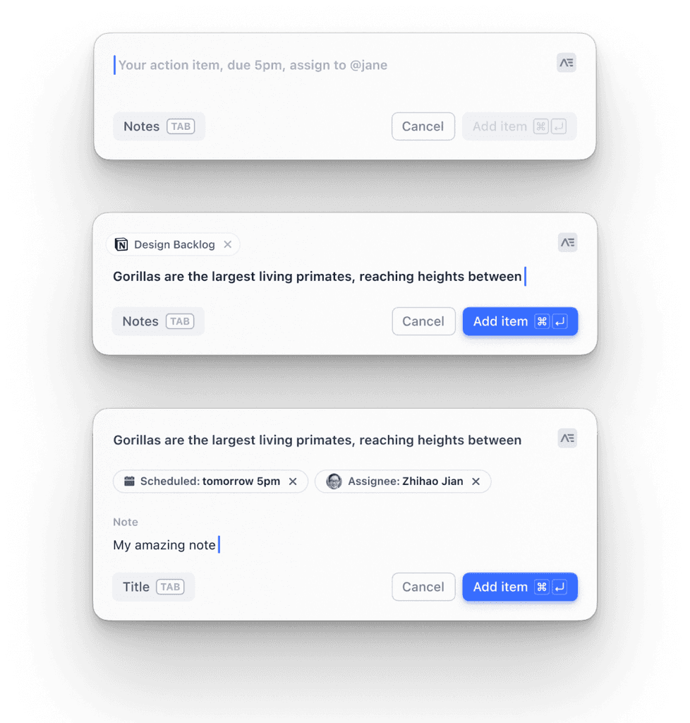
The Magic Bar — Add tasks from anywhere on your laptop and automatically pull context from any application you were in, by simply pressing a key.
Slack Connect — Add tasks by simply bookmarking a message and have it automatically appear in the calendar.
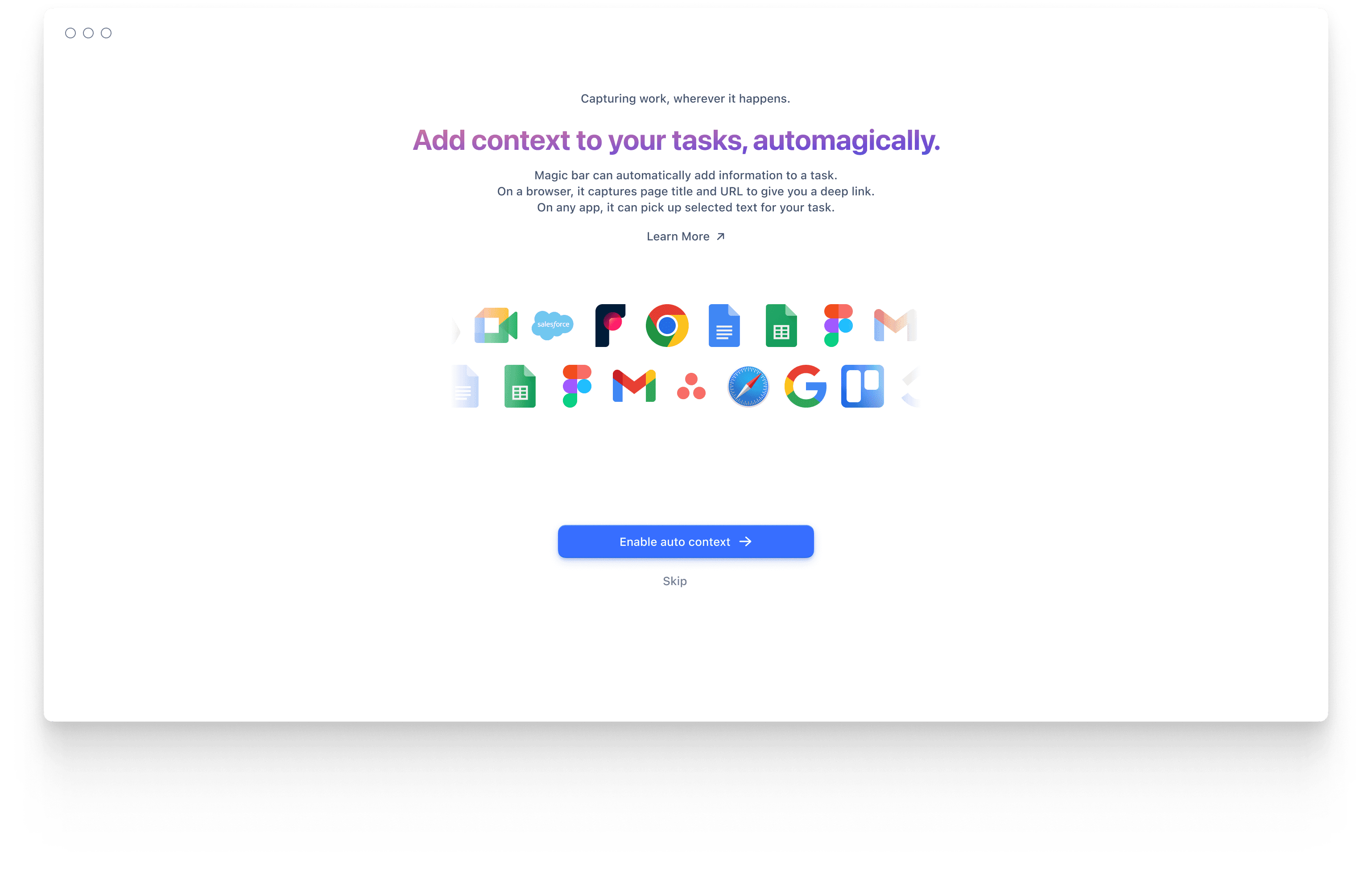
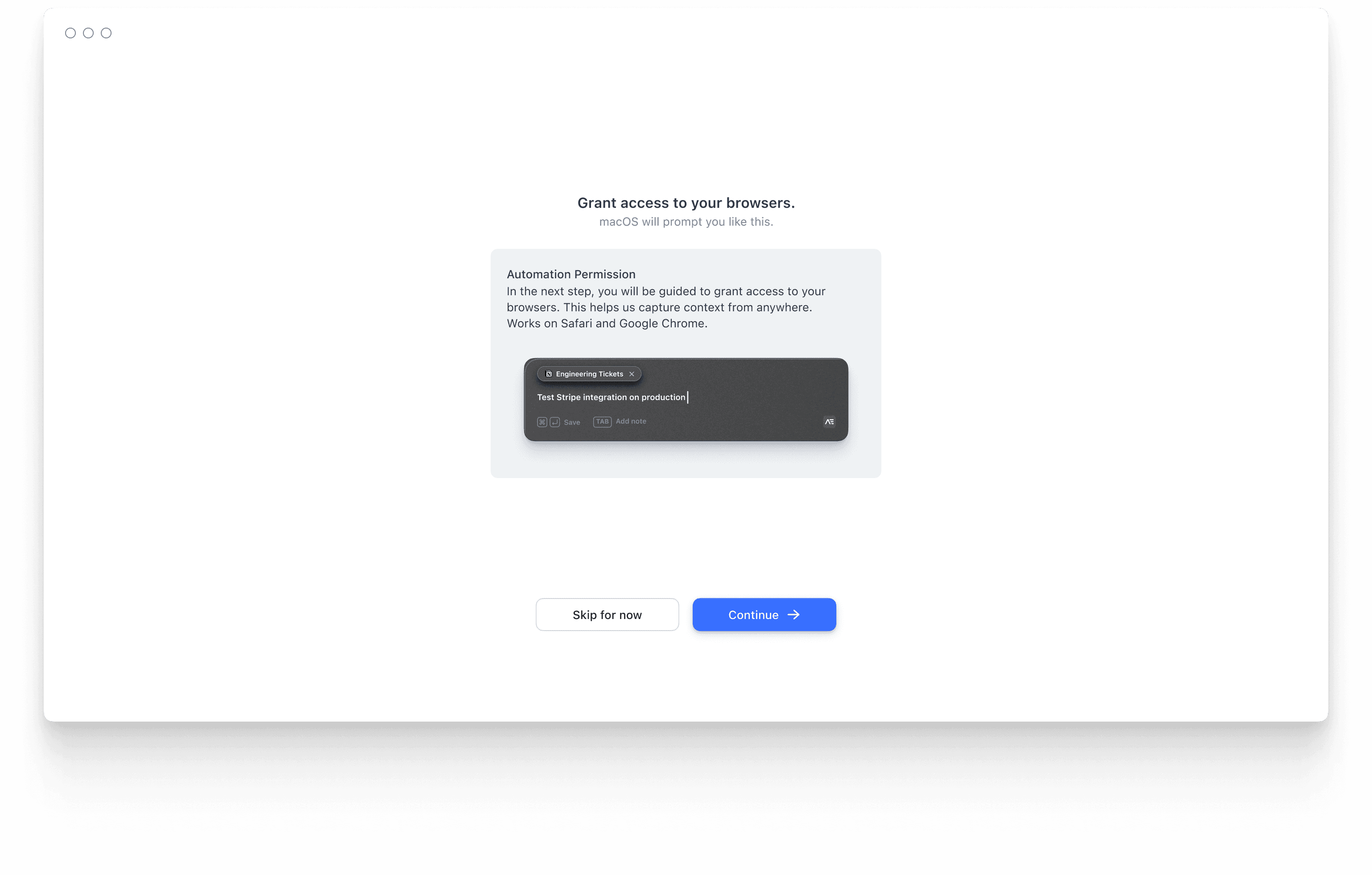
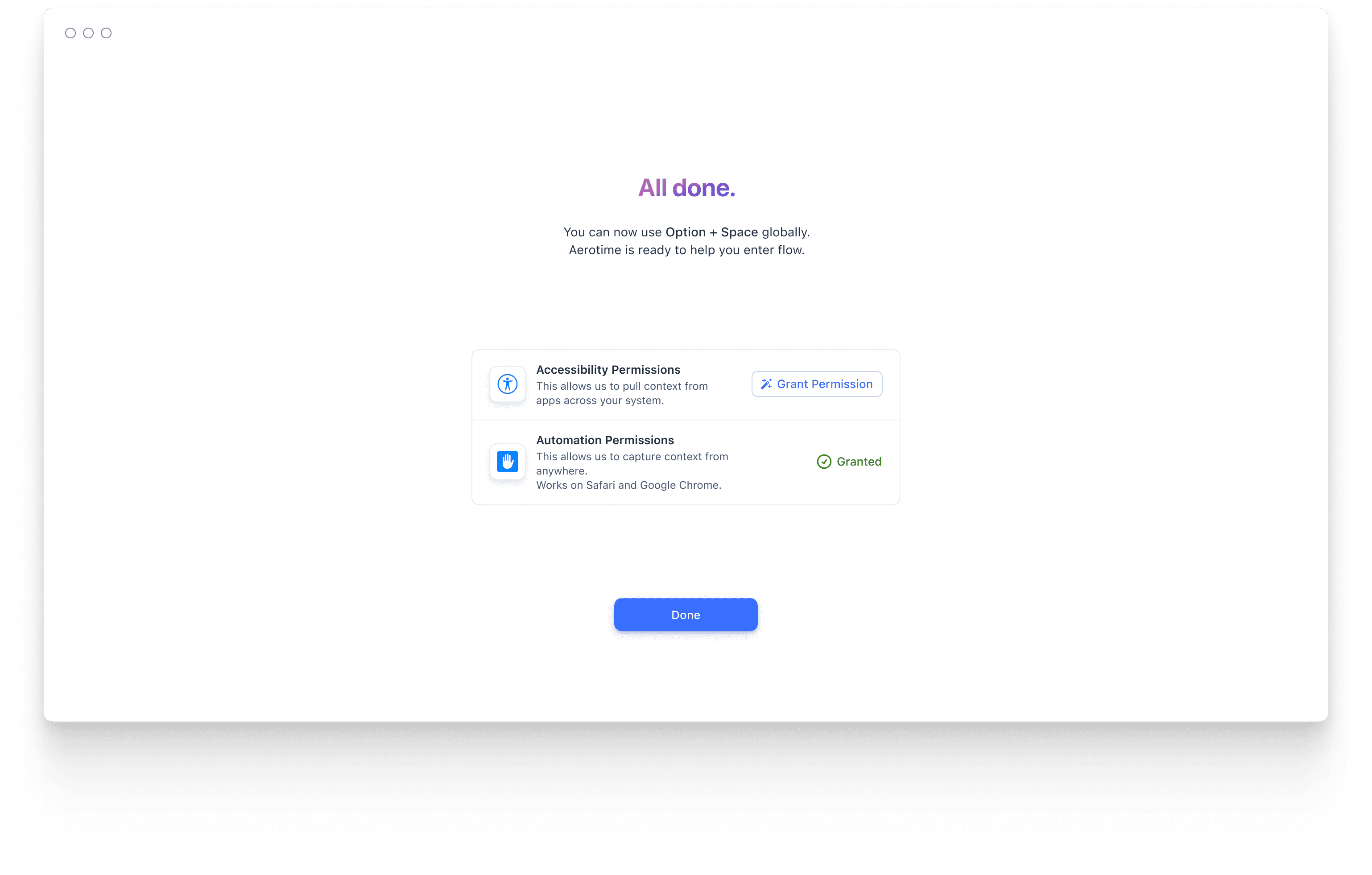
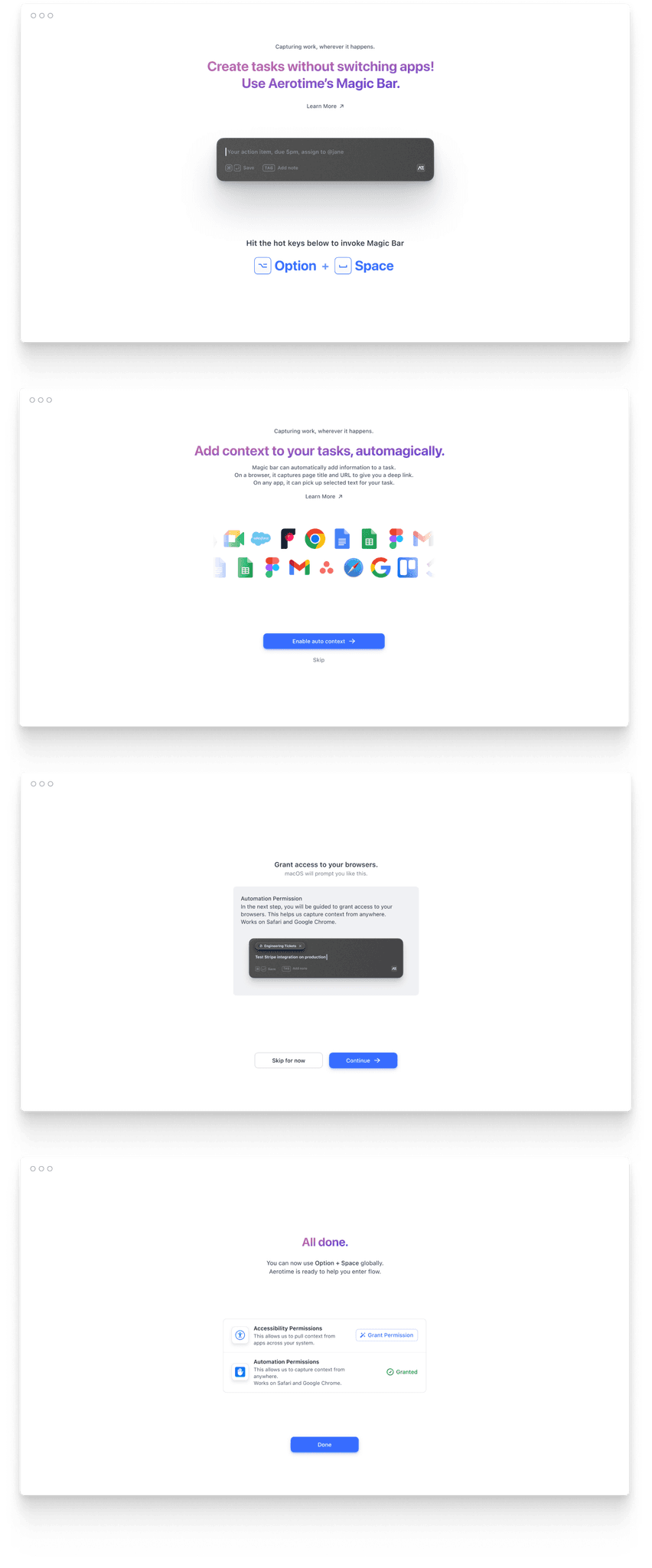
Onboarding screens to introduce the magic bar.
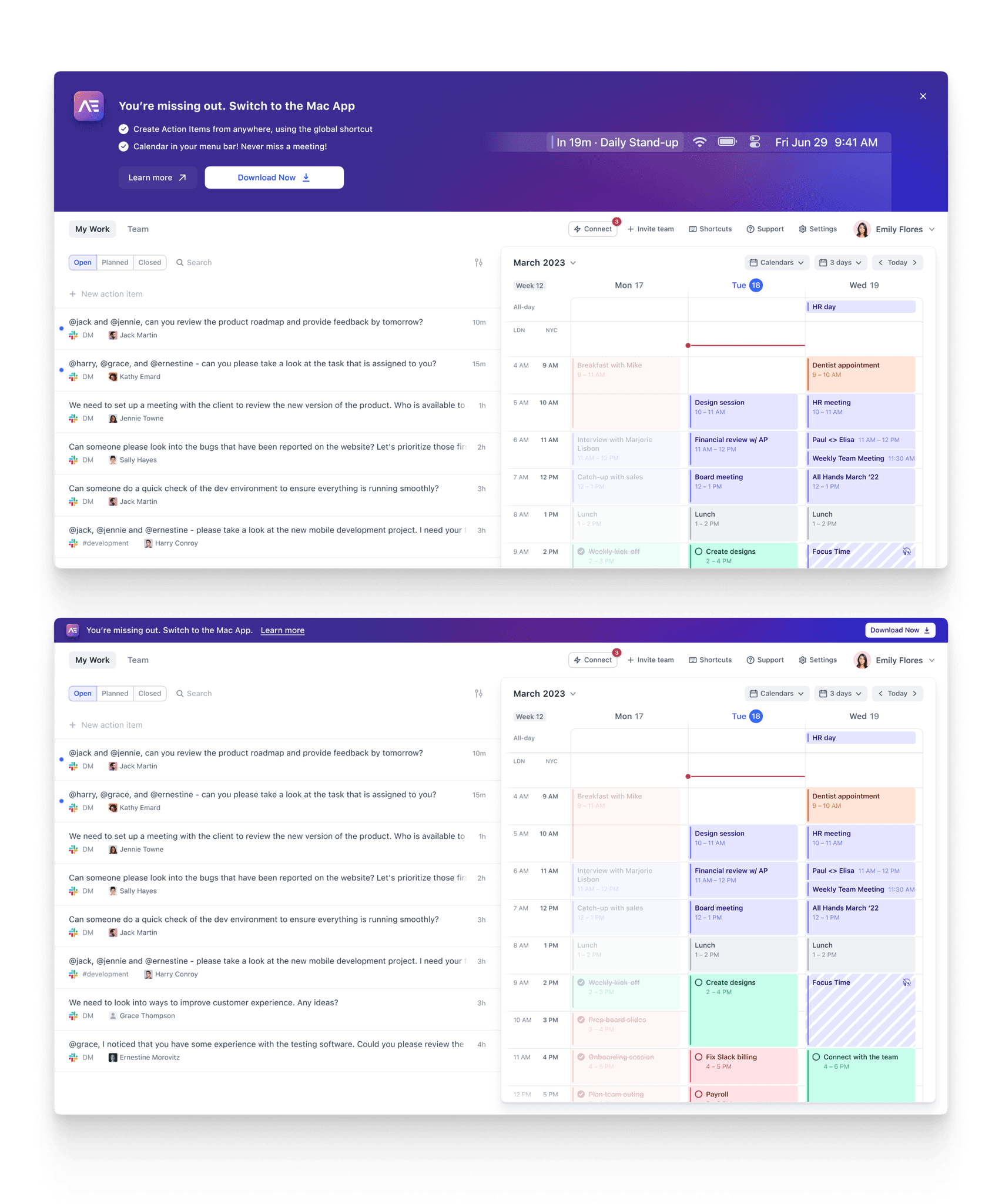
Not so gentle nudge, gentle nudge. For the browser users.
Flow to onboard users onto Aerotime, retaining only critical features.
User Interface
This is where we did the bulk of the work with Aerotime.
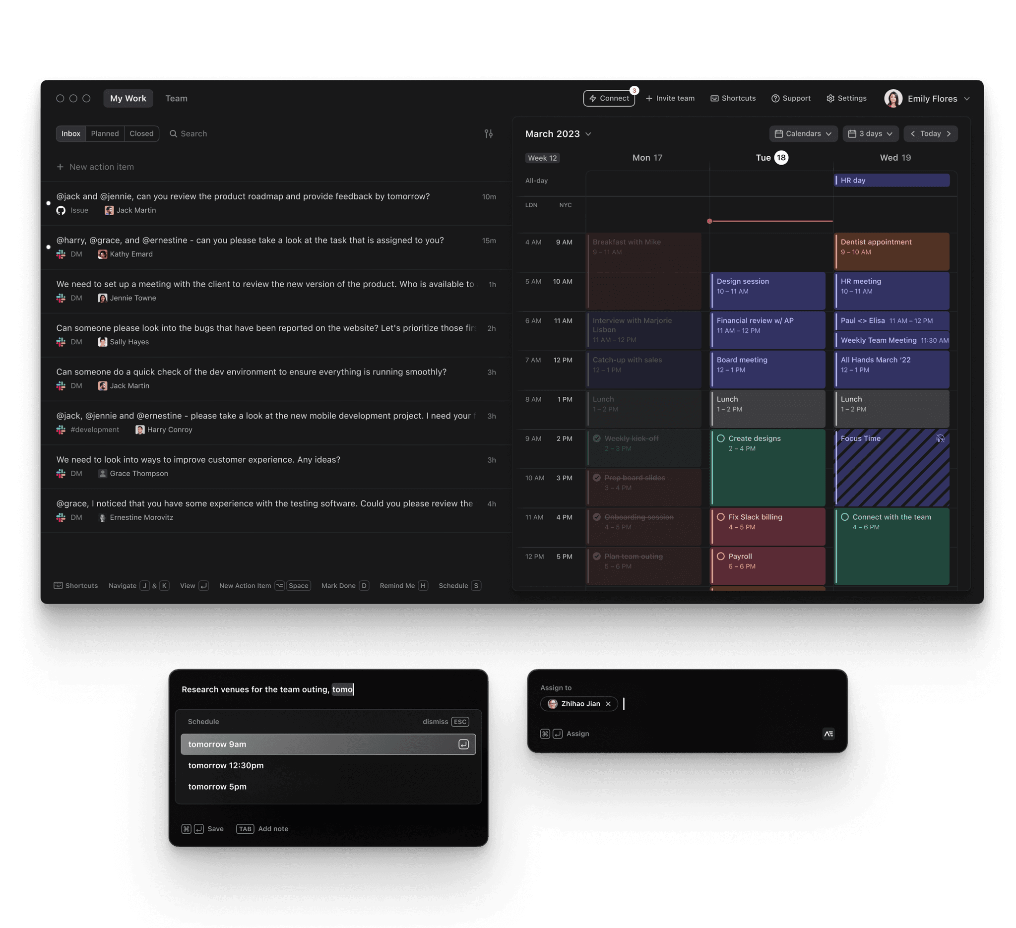
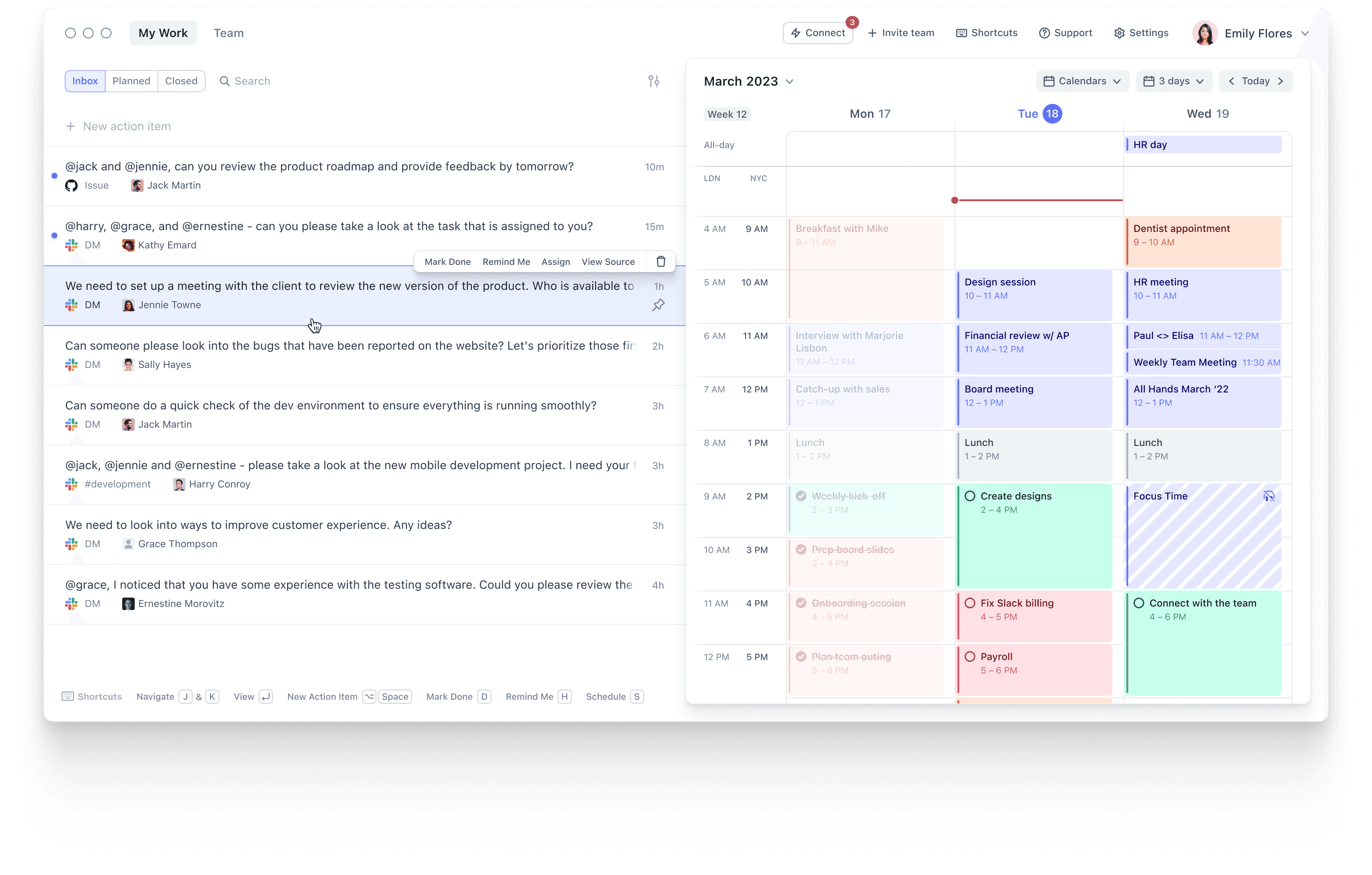
For Aerotime, we used a two pane design that allowed users to collect tasks from across their system and schedule them in while respecting any focus holds that they had programmed in.
We'd ship new features every Monday and deploy fixes if we noticed issues in user sessions. This allowed us to usually run very fast, requiring us to always stay one step ahead of engineering.
We encountered and pushed some super fun ideas that included subtly nudging users to prioritize focus sessions in their days, helping people work in flow and ensuring that a task list does not fail because it has become unusably large too soon.
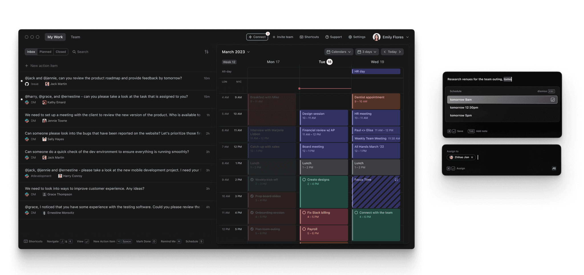
The main interface screen pictured along with the task add pane.
Making a Task List Usable
One of the issues we discovered with almost every task management application was how the open task list becomes utterly unusable within a few days. You miss closing an issue for one day, but the inflow does not stop, and before you know it the list is completely flooded with unachievable goals.
This was an issue that we set out to fix. We tried to make the process of going through your inbox a more mindful one, choosing to retain a simple pin feature alongside the task rearrange option.
The two paned layout for the main screen that formed the bulk of the interactions.
Product Development
Prioritization
Helping people prioritize their work at the start of the day was one of the most fun problems we had a chance to work on at Aerotime.
We’d notice that people would try to re–arrange items on their inbox view constantly (an interaction that did not exist) and realized quickly that this was indicative of a bigger problem.
This led to us deciding to simplify the interface drastically, reducing it to a two pane interface that would allow users to mindfully make the choice, and reduce distractions.
The Priority View would reset every day, ensuring that it never became unmanageable.
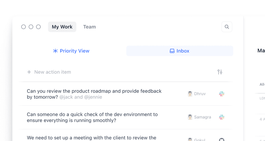
Some of the sketches that we considered to help users focus on just their top priorities for the day.
Magic Bar
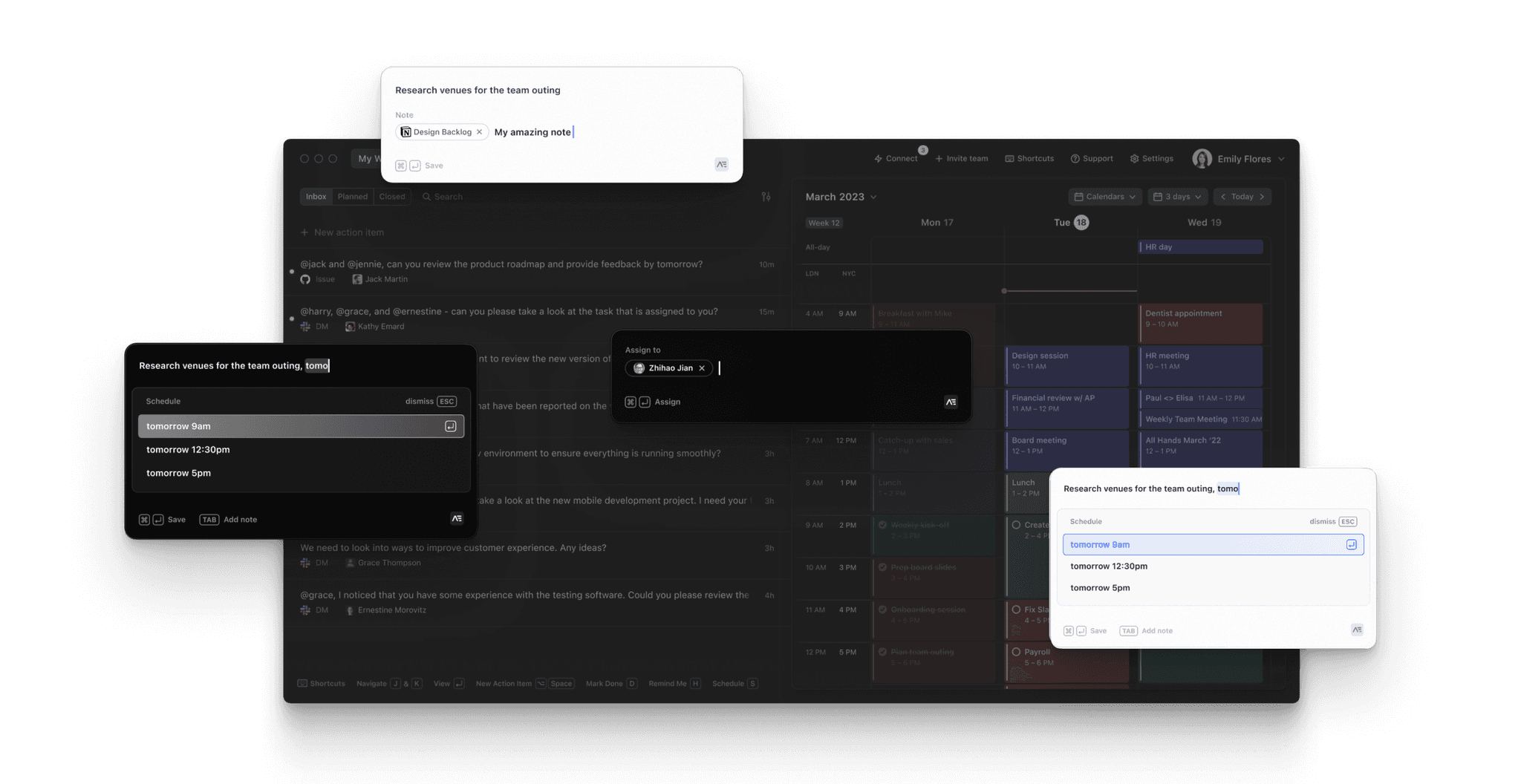
In the search for a time management solution that did not force you to context switch constantly to get work done, we came upon the idea of the Magic Bar—a way for users to quickly take tasks and set reminders for later without having to break flow.
One of the more cool features of the Magic Bar was that it was capable of automatically adding context to your tasks—if you were on a webpage and you launched it with Option+Space, it would capture the url and any highlighted text and save it to the context, dramatically reducing user effort.
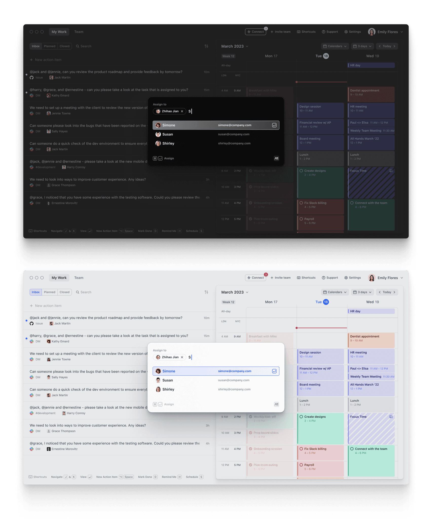
Task assignment workflow.
The quick task add feature we developed to allow users to add tasks from anywhere on their laptop without having to context switch back constantly.
Discovery
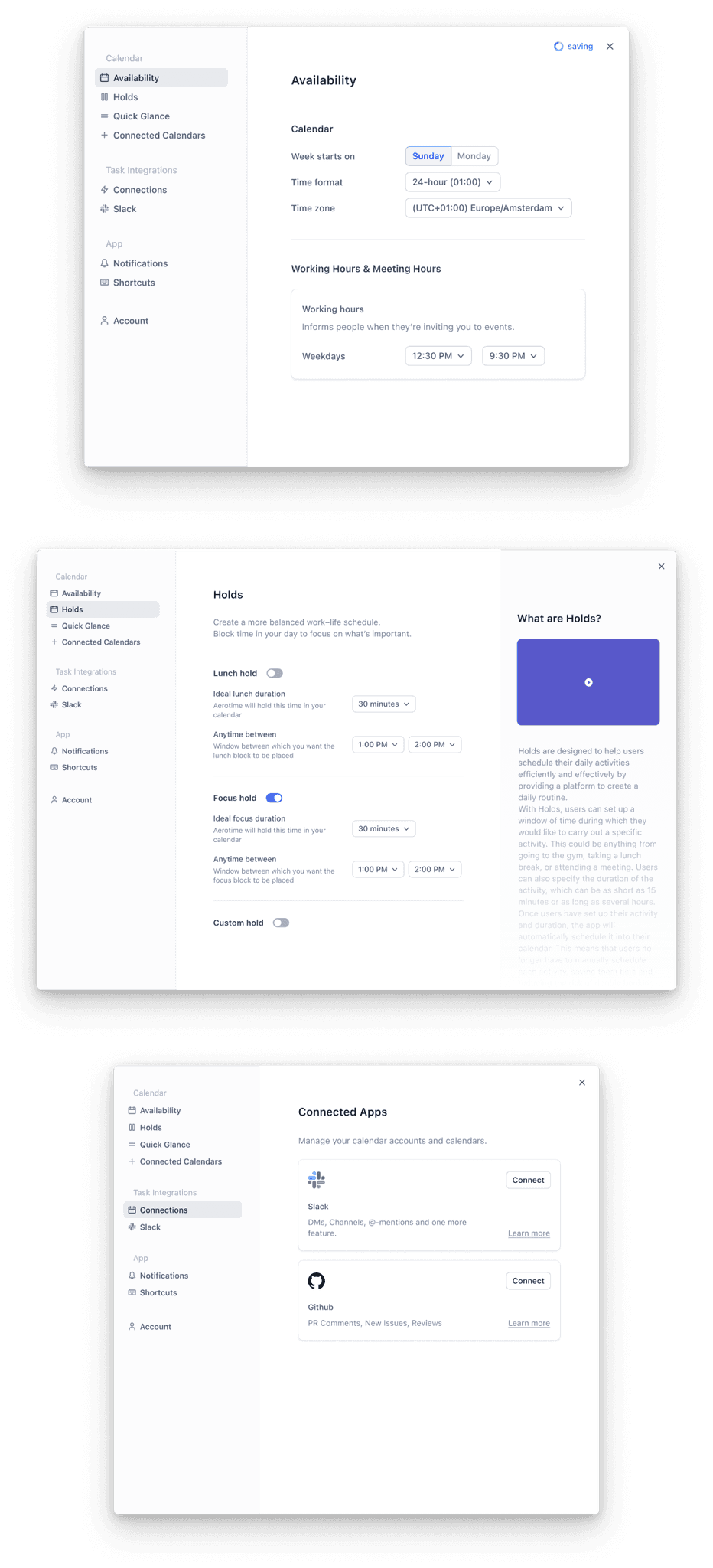
We noticed new users starting to become a little overwhelmed with all the options they could choose from, and at a similar time also realized that the settings pane had grown too large and fragmented.
We went through every interaction a new user would have with Aerotime, and tuned it to reduce the cognitive overload on first load.
We eventually prioritized only introducing basic features that had a direct impact upon user retention and tucked all the rest away within the settings panes along with short videos and descriptions.
Features like Holds, Quick Glance and all the other integrations were hidden away to allow users to discover them at their own pace.
The reworked settings screens that shipped to allow users to see the settings panes as a place for discovery.
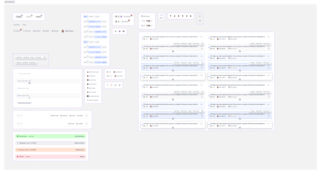
Some UI components inside the Figma document.
